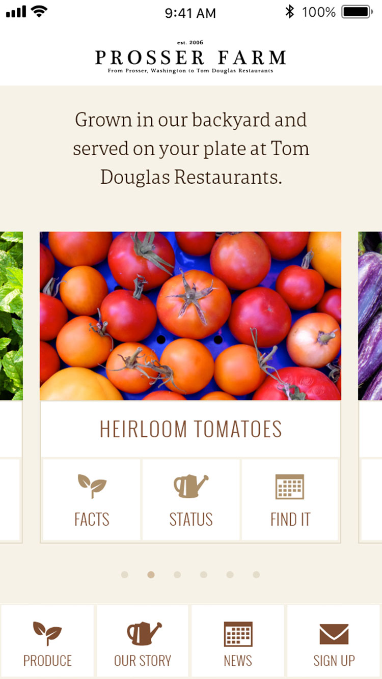
Prosser Farm Website
Background
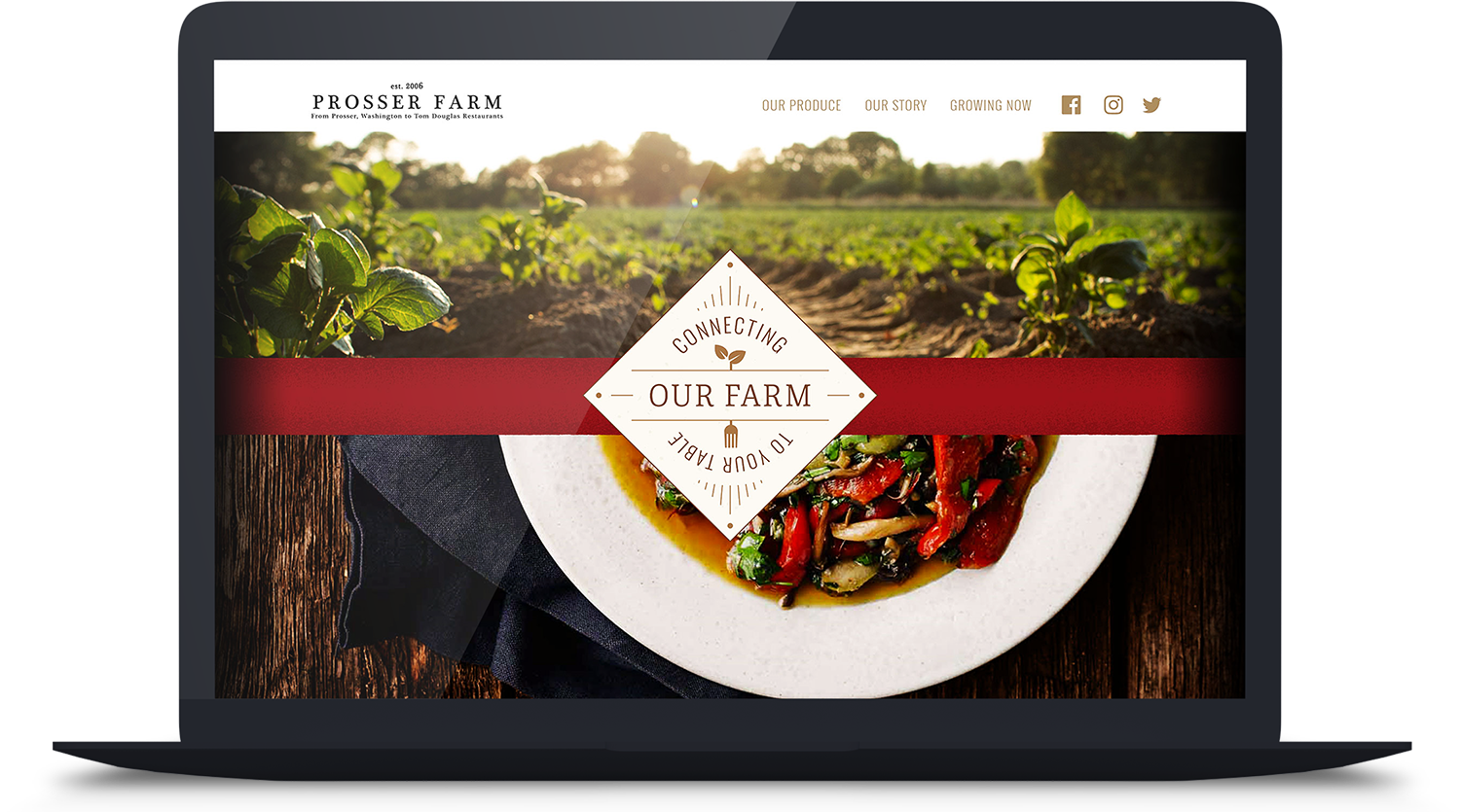
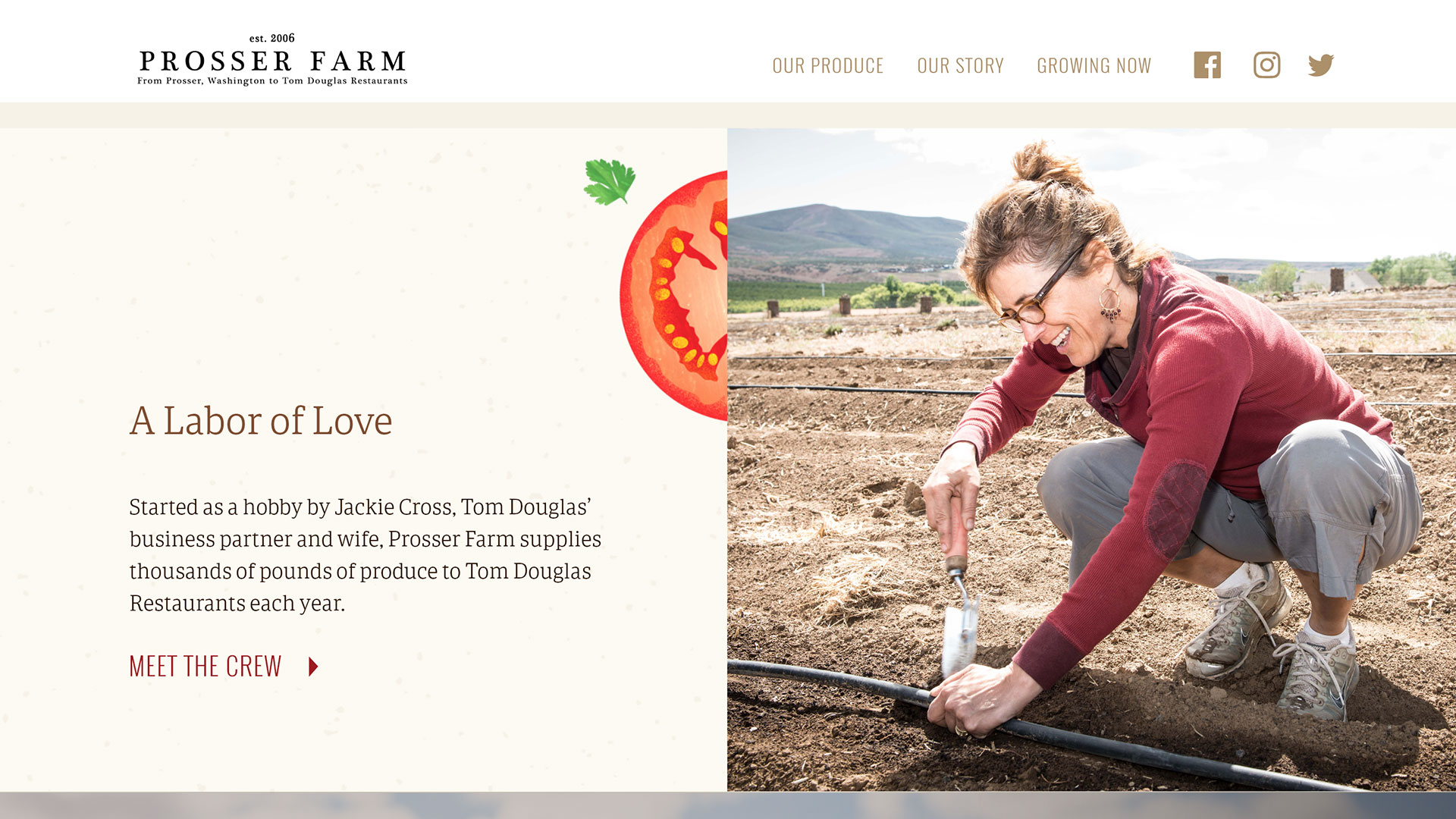
Prosser Farm produces more than 60,000 pounds of local, organic produce for Tom Douglas Restaurants each year, and provides educational opportunities for the restaurants’ chefs. The story of this unique farm addition to the restaurant group was not being told. Over the course of eight weeks, I worked with the Tom Douglas marketing team to visualize a website solution.
SVC Seattle: Capstone
Instructor: Luis Perez
Client: Tom Douglas Restaurants
Contributions
UI & Visual Design, Information Architecture, Brand Development
Tools
Adobe XD, Adobe Illustrator, Adobe After Effects
User Goals
Tom Douglas’ marketing team provided a design brief outlining their current restaurant audience. Knowing that the website needed to provide value to its target demographics beyond fulfilling the Tom Douglas business objectives, I outlined website goals for each audience.
Deepen loyalty and engagement of current Tom Douglas Restaurants core customers.
older, quality conscious, higher income, “foodie”
Introduce brand to a new generation and create a lasting connection.
interested in the new and novel, casual customer
Connect to a new audience with shared values.
value transparency, sustainability, local food
Visual Research
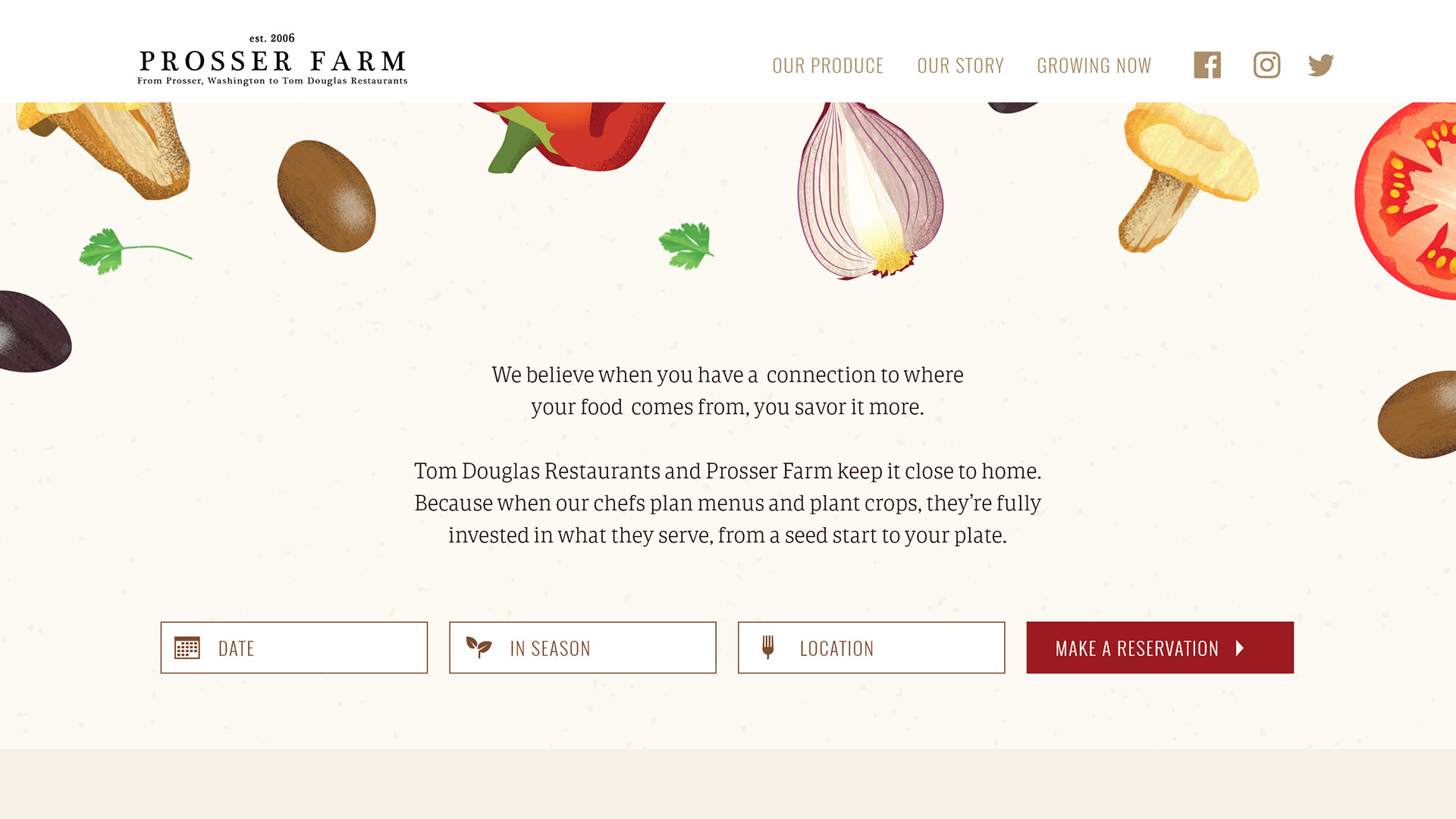
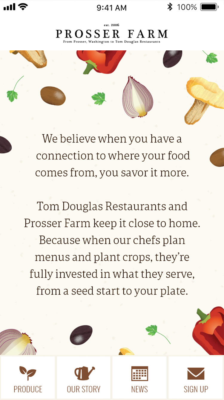
I based my visual concept on two frequently used keywords from the Tom Douglas design brief: storytelling and rustic. I settled on a dynamic, textured illustration style that could tell the farm-to-plate story while also appealing to Tom Douglas’ core audience demographics.

Branding System: Nurtured with Care
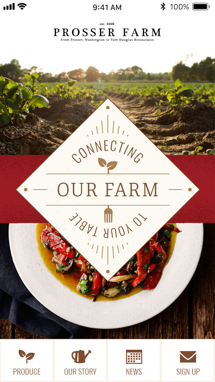
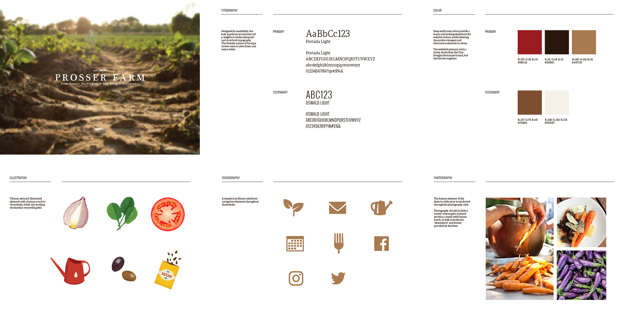
Rich earth-tone colors, readable, friendly typography and farm-to-table paired photography support the storytelling functionality of the website and connect the farm to the restaurant dining experience.
Mobile First
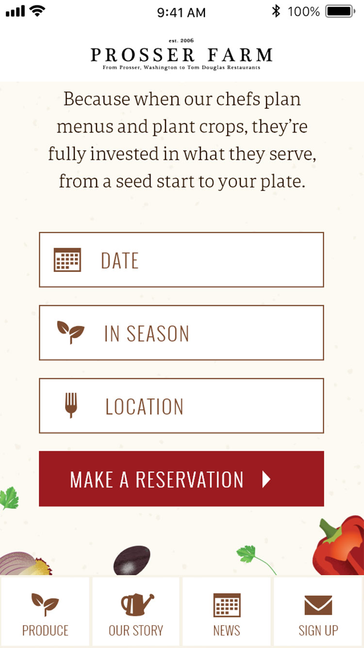
For customers on the go and making spur of the moment decisions, it was important that the home page quickly capture the unique story of Prosser Farm and easily connect to other Tom Douglas Restaurants.
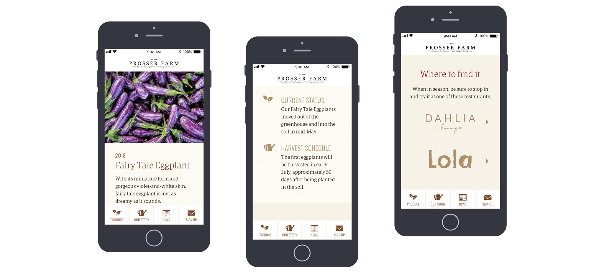
Incorporating a bottom navigation bar on mobile makes content easily accessible at any time.
Experts in the Field
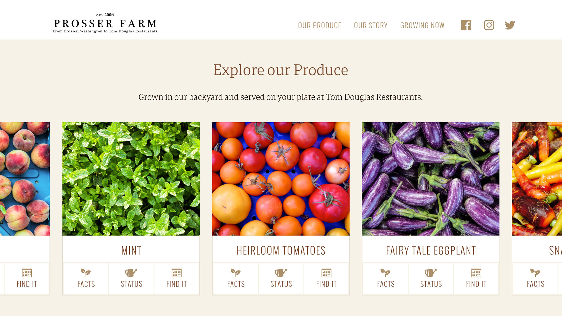
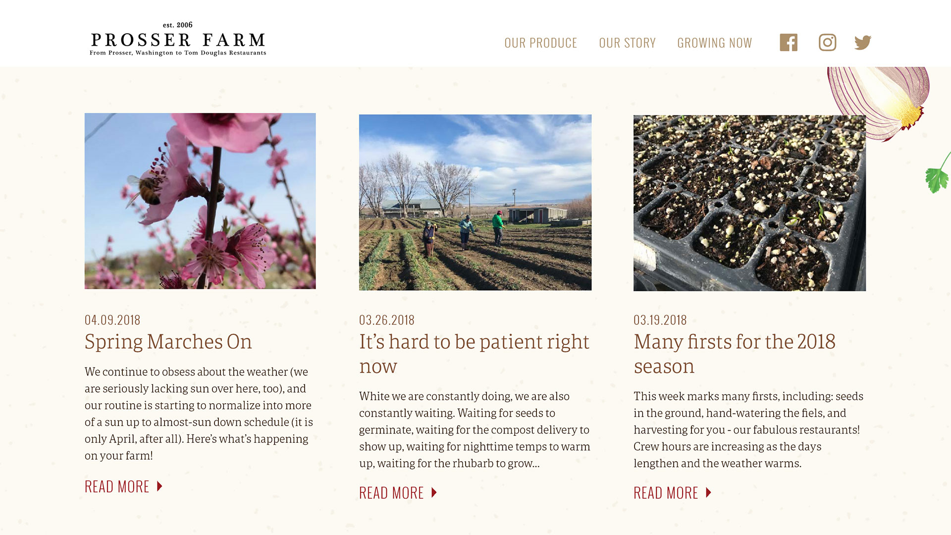
The site needed to have depth to position Tom Douglas Restaurant Group as experts in the farm-to-table movement. Incorporating real-time updates on produce from both the farmers and chefs provides added value to customers and gives them a direct connection to their food.
Prosser Farm on Desktop
The desktop version of the site incorporates a more conventional top navigation bar, but is designed to provide the same immersive experience as the mobile site. Users are encouraged to dive deep and spend time learning about how produce is grown and used by Tom Douglas Restaurants.
