Wishes in Flight Landing Page & Donation Form
Background
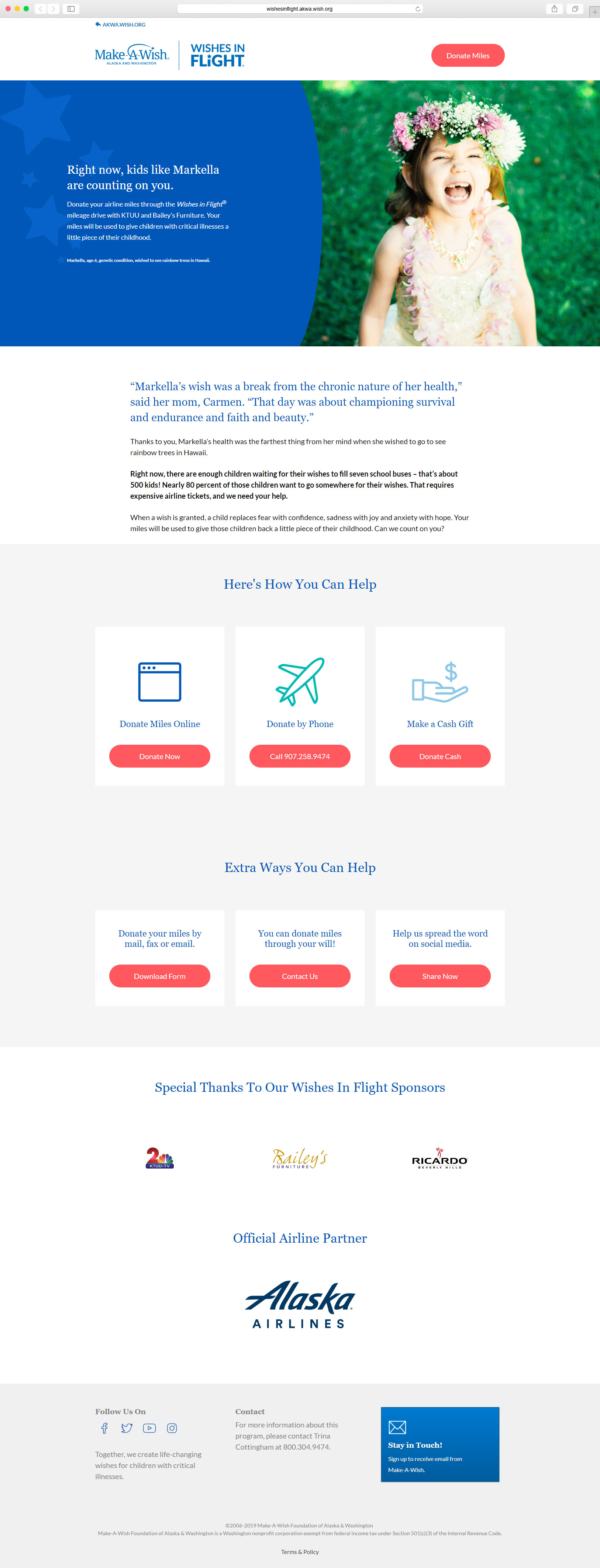
Airline travel remains Make-A-Wish Alaska and Washington’s single largest expense. Each year, the organization partners with several regional media stations to raise awareness of this unique donation opportunity through on-air mileage donation drives.
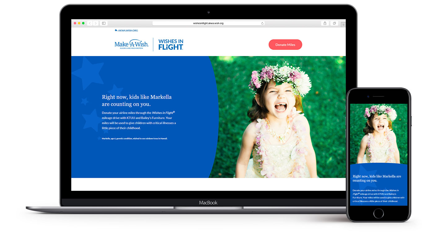
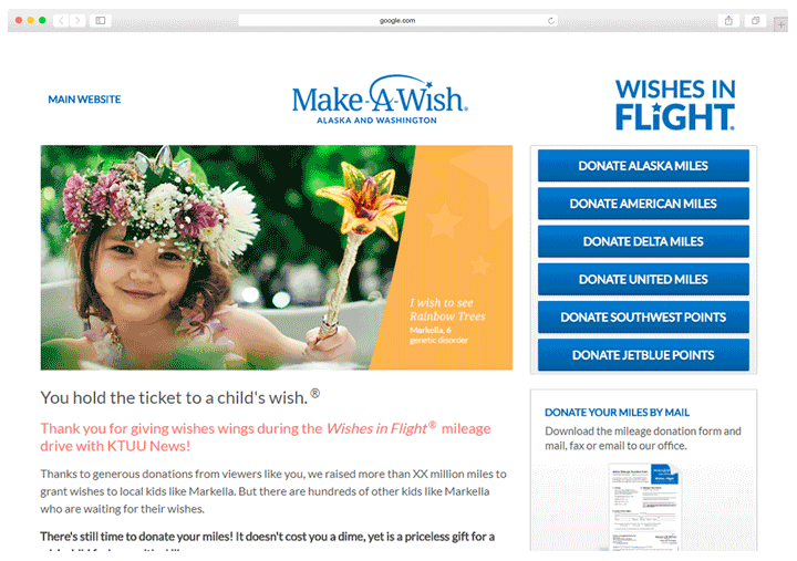
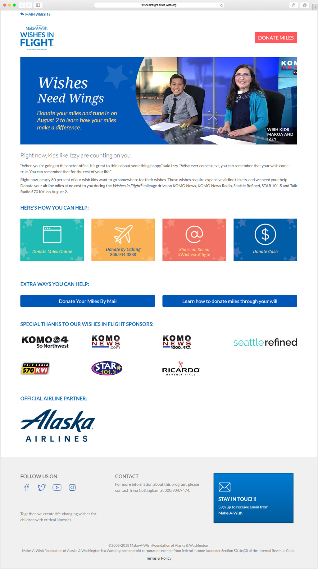
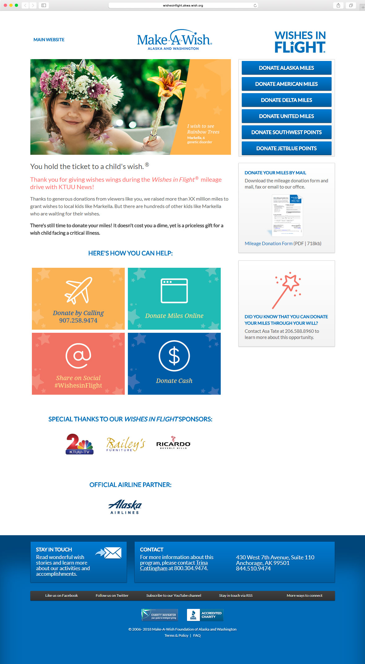
A branded Wishes in Flight landing page and donation form were created to streamline and optimize the miles donation process for television and radio viewers wanting to donate their airline miles and expand the program to corporate donors.
Client: Make-A-Wish Alaska and Washington
Contributions
UX, UI & Visual Design, HTML & CSS
Tools
Adobe Photoshop, Adobe XD, Visual Studio
The Challenge
The Make-A-Wish organization is made up of chapters that grant wishes and fundraise in their regional markets. While national airline partner donations are supported through Make-A-Wish America’s online tools, users were sent offsite to complete their donations for non-national partners. There were a few key problems that the landing page and donation form were needed to solve:
Donors needed a single landing page where airline partners were displayed clearly and consistently, whether they were national partners or not.
More than 70% of airline miles donations to Make-A-Wish Alaska and Washington were donated from non-national airline partners. The organization wanted to capture contact information before sending donors offsite so that they could thank airline donors and reengage them for future gifts.
The Process
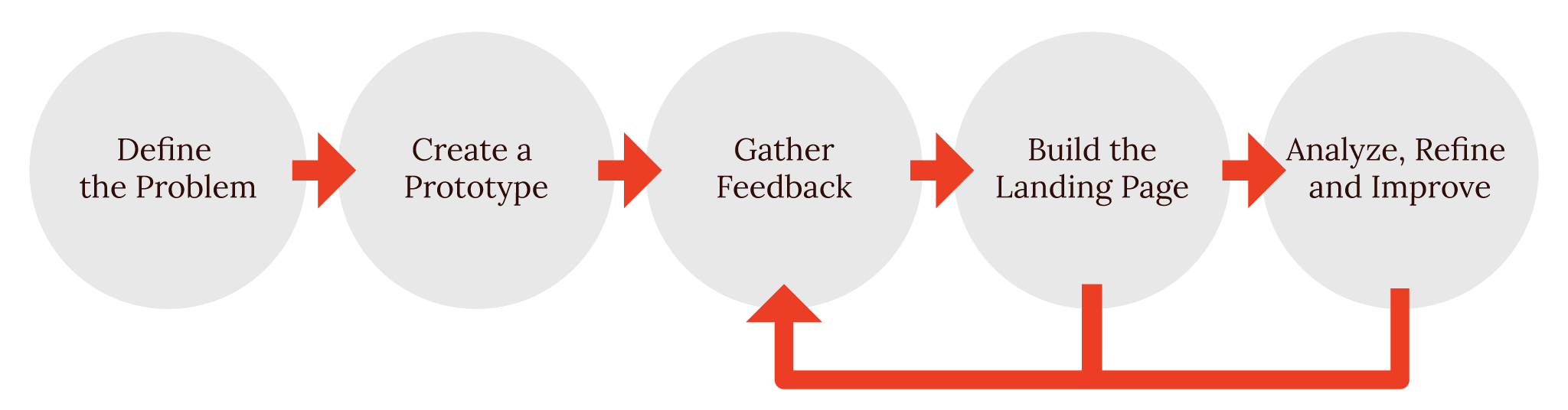
The Prototype
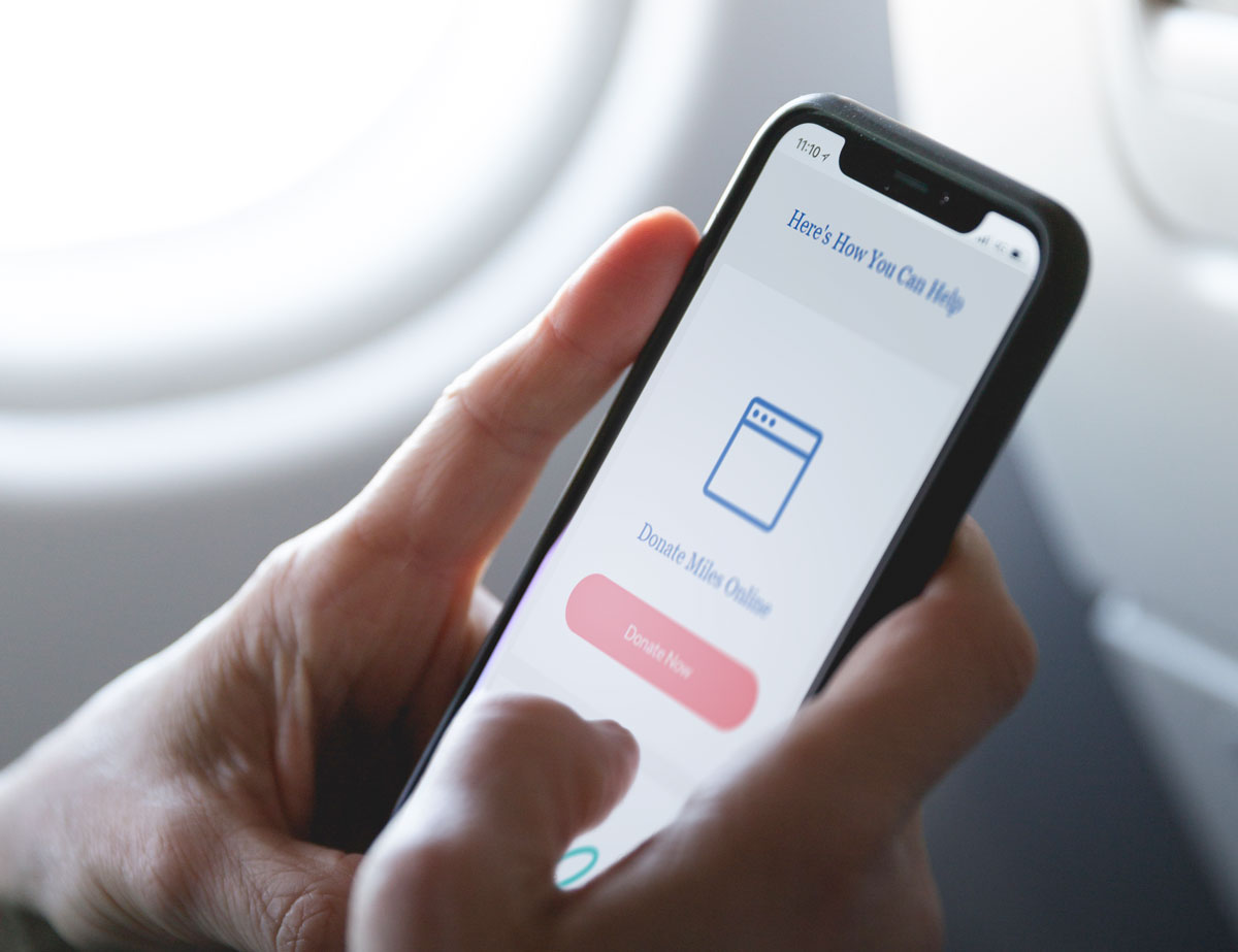
I worked with a copywriter and created a quick HTML mockup to identify how the layout and calls to action might be structured on the landing page. We pushed the page live in advance of a media miles drive in one of our smaller media markets and were able to get some valuable initial user data, such as a higher percentage of mobile traffic vs. our regular website, to inform the site build-out .
CMS Build-Out
We brought the project to a developer at Hero Creative to help build and implement new features. I created a priority map to ensure our most needed features were tackled first. In addition to creating a donation form to address the donor contact information priority, we also rebuilt the page on a CMS backend. Moving to a CMS would allow:
A lower entry barrier for staff members to make updates without knowledge of HTML.
Better source tracking so the miles donation program capacity could be expanded and multiple drives could be hosted at the same time.
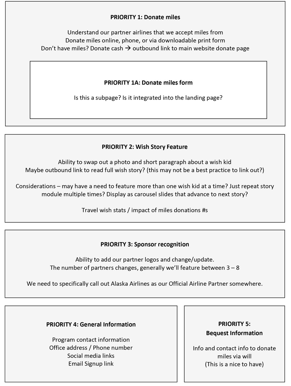
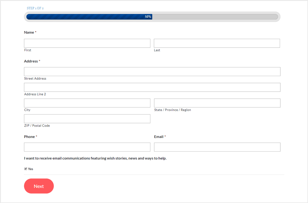
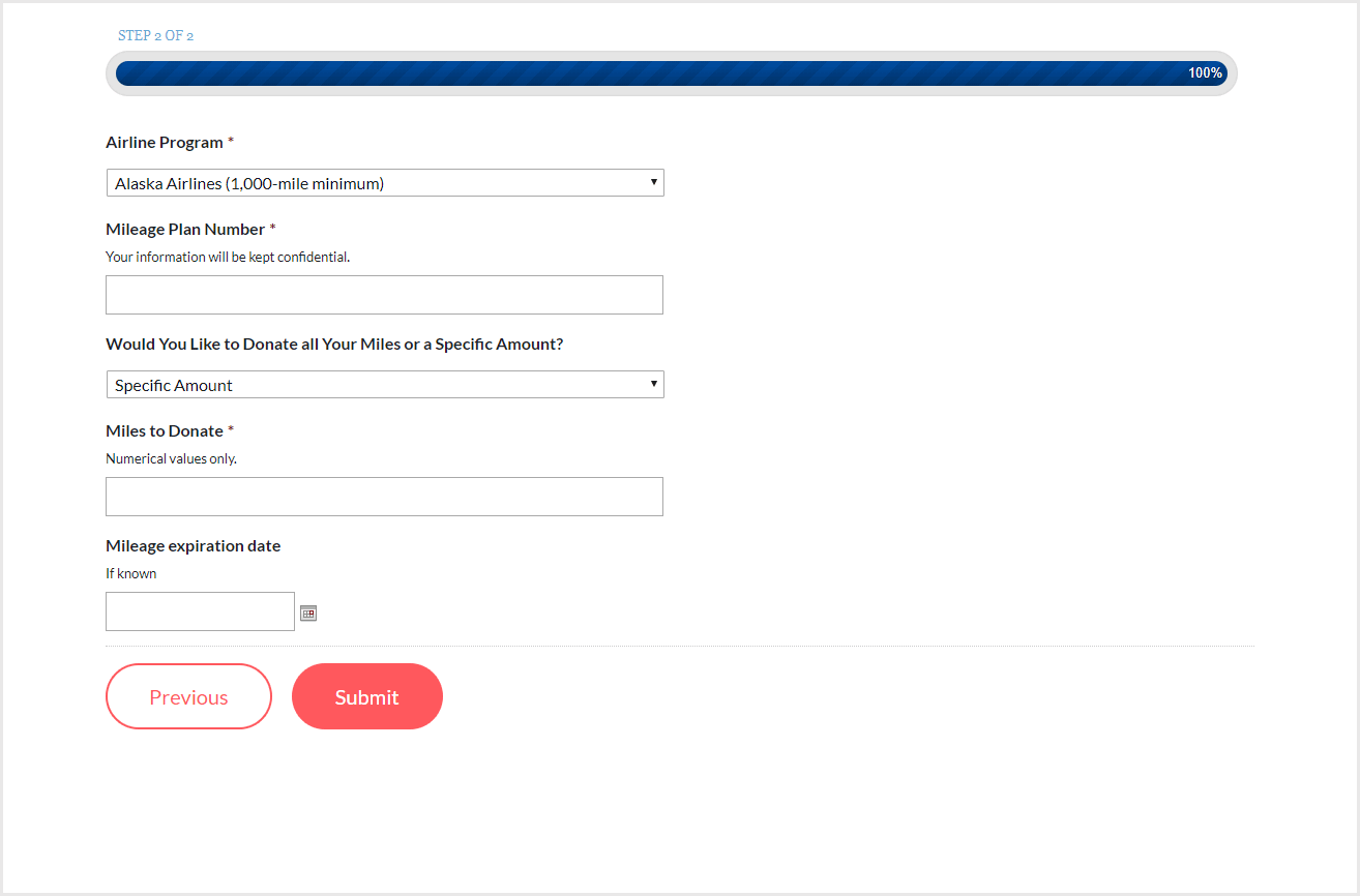
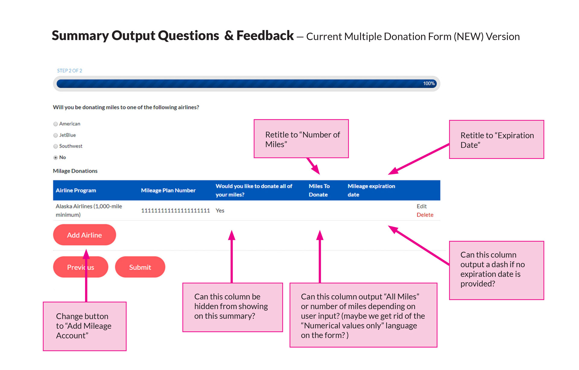
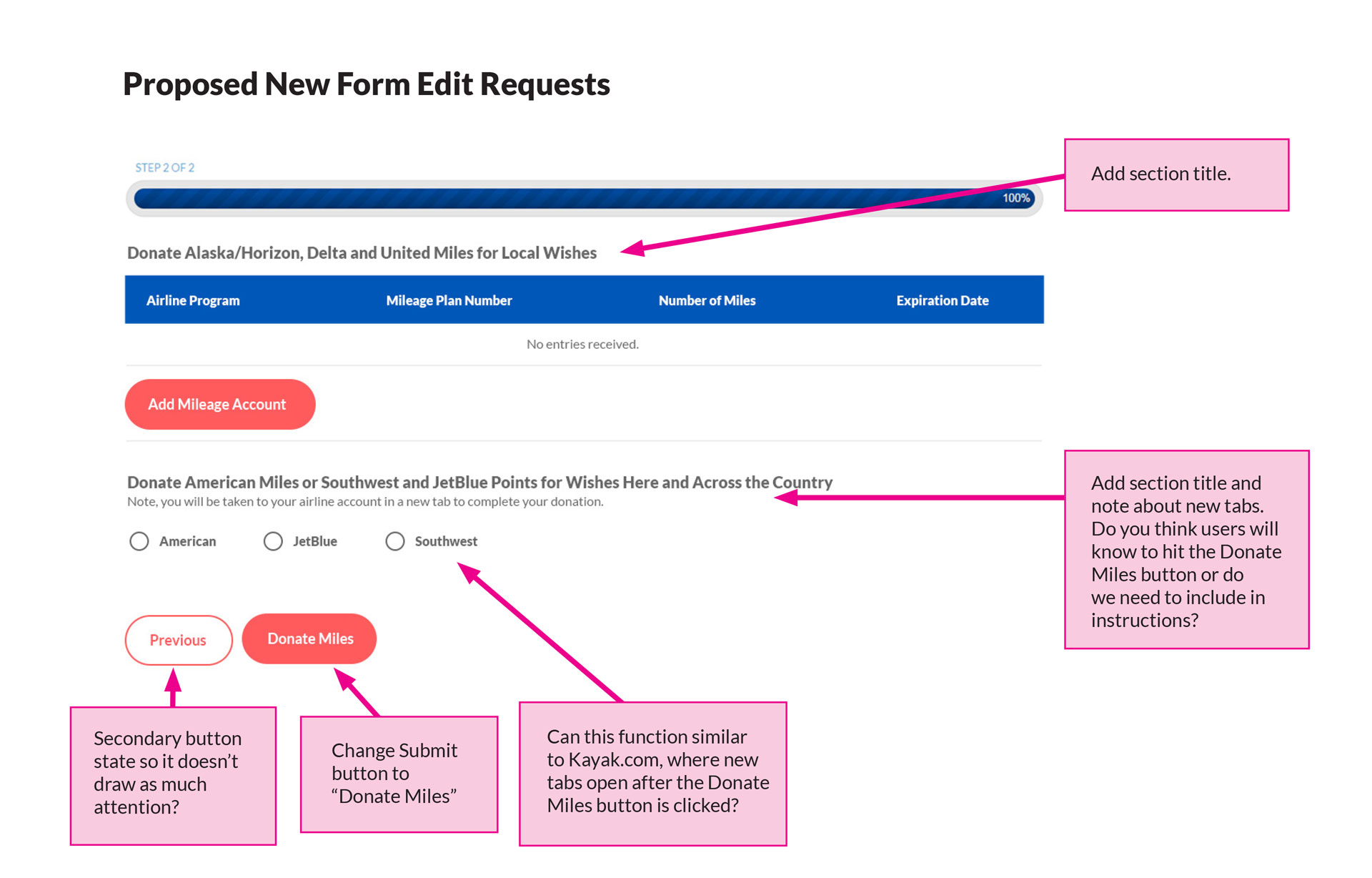
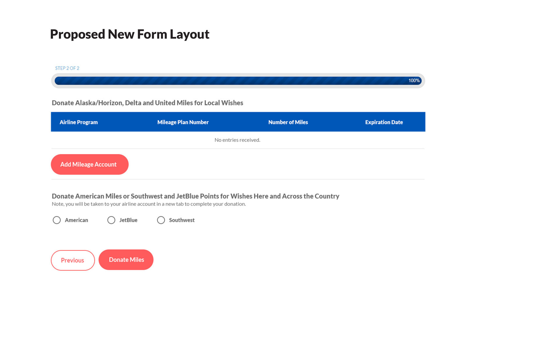
Breaking Down the Donation Flow
To accommodate the increased mobile users seen in the prototype, the donation flow was simplified and broken down into two smaller steps: Contact information and Donation information. By gathering contact information from all airline miles donors, we would now be able to attribute each donation with certainty to the appropriate media or corporate drive and scale the program by hosting miles drives at the same time. The two-step process also allowed us to provide real-time totals to announce during on-air media drives and to corporate drive hosts, rather than waiting weeks or months for an airline to transfer miles to the Make-A-Wish account.
Phase 1 Accomplishments
The launch of the landing page marked a huge leap forward for the Wishes in Flight miles donation program. Investments in online tools resulted in a number of accomplishments and new features to increase the capacity of the program, including:
Ability to host multiple drives at the same time.
Miles donations can be reported on in real-time.
Ability to steward airline miles donors.
Co-branding opportunities for corporate partners.
A responsive layout friendly to mobile donors.
Learnings and Revisions
While the new site significantly increased the capacity of the Wishes in Flight program, we knew there were still improvements that could be made. After gathering data from the landing page and feedback from our corporate users, we identified additional updates to improve the overall user experience. The priorities for additional front-end and back-end features in Phase 2 included:
Improve miles donation tracking.
Sometimes the tracking is lost when donors make a second donation.
Increase Mobile Friendliness.
Centered blocks of body copy on mobile are not friendly to readers. Text embedded in images is too small to read on mobile.
Create a triggered email receipt confirmation for donors.
Users have no record of their donation after leaving the donation confirmation page and are unsure that their donation went through.
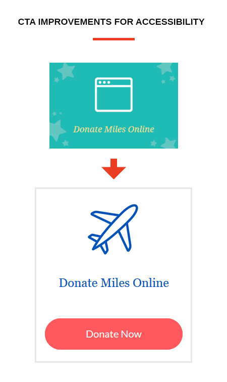
Improve accessibility.
Images and color contrast do not meet web accessibility standards.
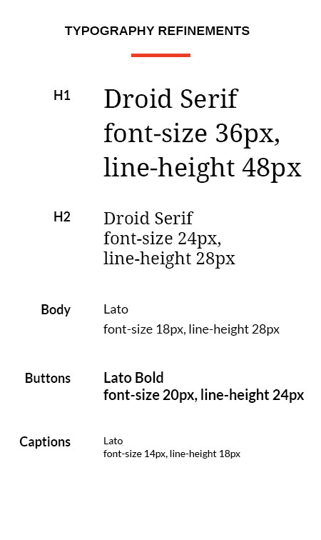
A More Accessible Visual Design Language
Significant changes were made to improve the consistency of the visual design during Phase 2 to improve inclusivity and increase mobile friendliness.

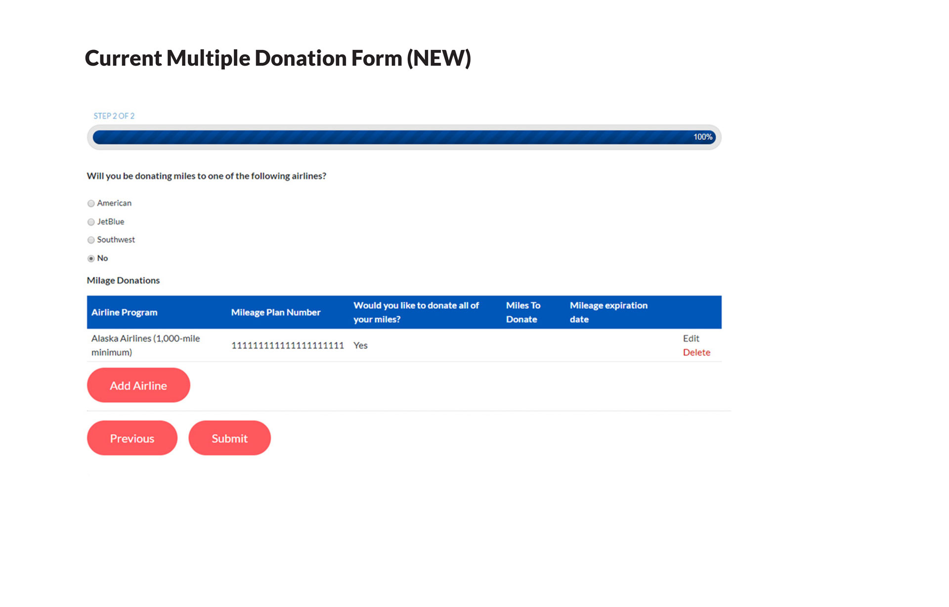
Revised Donation Flow
Perhaps the biggest surprise from our Phase 1 donation form was the number of donors that made multiple transactions. The original donation form easily facilitated a single transaction, but donors would have to restart the form and resubmit their contact information to make a second donation. I worked with the developer to revise the form and allow donors to add multiple airline accounts to a single transaction.
The Results
Prototype
Phase 1
Phase 2
Launch of Phase 2 Landing Page
In the six months since the Phase 1 launch of the landing page, we’ve seen an increase in mobile donation conversions by 5% and growth of overall miles donations by 8% year-over-year.
Phase 2 of the landing page was launched in early 2019 and marked a number of improvements to increase overall user experience and accessibility, which we hope will continue to facilitate increased growth of the program.
We will continue to monitor and make adjustments to the Wishes in Flight landing page and donation flow based on page analytics and user feedback.